Often your website is someone’s only interaction with your organization.
In the absence of a real person, your site needs to give attention, serve customer needs with ease, and make them feel valued. Hopefully customers leave with a better impression than when they arrived (or at least not worse). These things help build a relationship with your organization – one that will encourage repeat visits and business.
One critical element to forming trusting relationships is listening. People like to feel heard and understood. When face-to-face you might nod your head, concentrate on looking at the person speaking, ask them questions to learn more, and affirm what they are saying.
How can a website show that it is listening?
I’m not talking about the literal voice search or a chatbox. I mean the not-so-obvious cues, that if done well, will go unnoticed. These subtle interactions and responses smooth the user experience and let people know you hear them:
Visual feedback
When someone finishes a task, let them know it was successful. If they click a ‘purchase’ or ‘submit’ button, give them a thank you message, confirmation number, or receipt. Whether it’s on a new page or message in the same area, a positive visual indicator will stop them from wondering “did that go through”?
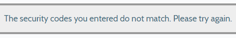
Helpful error messages
It is frustrating when you submit a form and it doesn’t work. Be sure to provide clear error messages that not only state what happened, but why, and recommend what they should do next. Here’s a great article on the Art of the Error Message. And make sure the error message displays in their view or they won’t realize there is an issue. They shouldn’t need to scroll to see it.
Progress bar
Does your registration or purchase form involve a multi-step process? Add a progress bar to show people what step they are on and how much is left. Setting expectations is one of the most important factors in a satisfying user experience.
Thoughtful search results
Don’t settle for the default settings of your Content Management System site search. Many can be highly configured to deliver more relevant search results that align with your customers’ needs. Add topic labels, date filters, set up synonyms, etc. to get people to what they want faster.
Visited link colour
When someone clicks a link, it should change colour to show them they have already visited it. Purple is the default colour, but you can choose, so long as it is different from unvisited links, headings and body copy. Google does this effectively; after you’ve hit the back button you can see where you’ve already clicked.
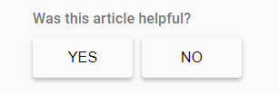
Ask for feedback
Invite a star rating or review, or link to a simple feedback form. While only a small percentage will fill it out, people appreciate the option to easily share feedback.
Moments to remember
Listening is also about remembering information that people provided to you on prior visits.
Remember preferences
Set cookies to remember a username or language selection that someone identified previously.
Remember behaviours
Show personalized content for return visitors based on where they spent time last visit. At the very least don’t show them that pop-up survey they already filled out!
Pre-fill form fields
There is no need for someone to fill out a billing address and a mailing address if they are the same. And if they are already logged in fill in what you know about them. (But always give people the opportunity to edit.)
Please stop talking
The most important way to show you are listening is to just shut up! Remember: people don’t want to read, they don’t want their time wasted, and they don’t care about 80% of the things you care about (i.e. 2-year-old press releases!)
Your content needs to be concise, efficient, and reflect the appropriate tone. It should feel like a conversation, not a lecture so write plain language, customer-centric content. Say what needs to be said and then invite the interaction. Offer some next steps in the way of links to relevant content. Ask yourself, “If my customer was interested in this, what else might they be interested in?” Suggesting these links is like asking them a question and it will help keep the conversation going.
Not sure if your site is listening well? A user experience audit can help.
