Your sitemap isn’t the only page structure you need.
When people think of how the pages on their site are organized, the sitemap and navigation menus are first to come to mind.
By definition, a sitemap is the hierarchical structure of the pages on your site. It starts at the homepage and the subpages are nested in a tree structure. As you click deeper, the topics become more niche. In a grocery store example, it might look like this: Home > produce > fruit > apples > red delicious.

If the grocer gets a shipment of kiwis, they know logically to put them in the fruit category. That’s where customers will look for them.
Navigation menus are usually based on your sitemap. Everything has a place. Your sitemap is logical and boring, and necessarily so, so that people can orient themselves and understand all of their options.
But buying something, or starting a relationship isn’t always logical. It’s emotional and complex.
There is significant research about how people can’t make decisions without involving our emotions. (See works by Antonio Damasio) So the logical sitemap isn’t necessarily aligned with how your customers engage with your products or services.
It’s useful for wayfinding, but if your potential customers have to rely on your navigation menus, you’re disrupting the flow of their buying process.
Enter the journey architecture
Sometimes referred to as persuasion architecture, the journey architecture is a way to structure and link information on your website to align with the decision-making journey of your audience and persuade them toward conversion.
Unlike the hierarchy of the sitemap, the journey architecture is a matrix structure. One item or page might relate to many others. It’s more subjective and based on the customers’ process and needs.
How do we create a journey architecture? It’s formed with a series of calls to action, strategically placed so your story, to persuade them down the path to conversion..
Craft the story you want to tell
Do you remember the Choose Your Own Adventure novels of the 80s and 90s? These were young adult adventure stories and at the end of the page, it offered a choice, like:
- If you choose to go back home, turn to page 16
- If you prefer to follow the stranger in the blue coat, turn to page 21
It meant you could read the same book multiple times, and have a new plot and ending each time.
This is how you should treat each page of your website.
Because people don’t read websites front to back like a book, they need to be able to orient themselves and pick up your storyline. You’ve got to offer options in the context of the content they have just read.
When you do, your audience is more likely to follow them.
Follow the customer journey
Where are these strategic locations you put the calls to action? Well, follow the journey.
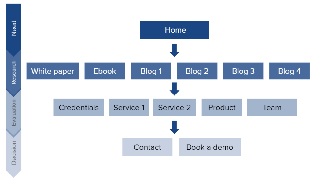
Here are the typical phases of a customer journey.

The questions that your customers need at each phase should form your website content.
Need ⇢ research stage
When people are in the research phase they are gathering information. Their searches tend to be “how to” questions. If you’ve talked to some of your customers, you know what these are. Hopefully you have some blog posts that are designed to catch people doing these searches.
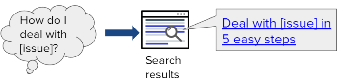
So, now your potential customer is on the blog post – research phase content. They are learning that you know what you’re talking about and feeling confident.
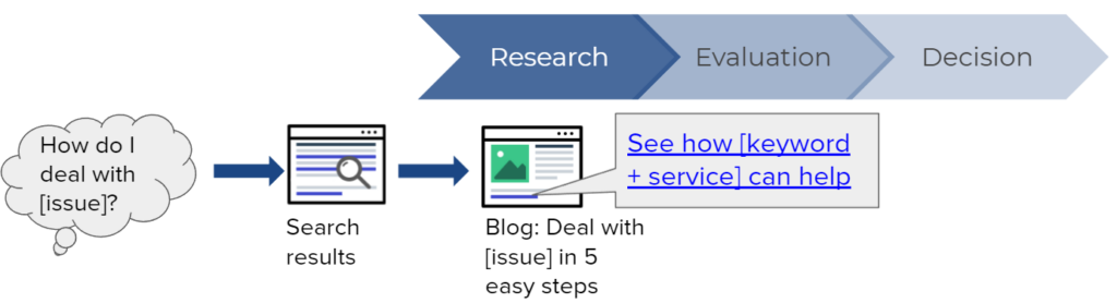
Research ⇢ evaluation stage
The goal is to move them along to the evaluation stage. Towards the end of the blog post, in context, you include a call to action that links to the most relevant evaluation page. Imagine you take them to a services page.
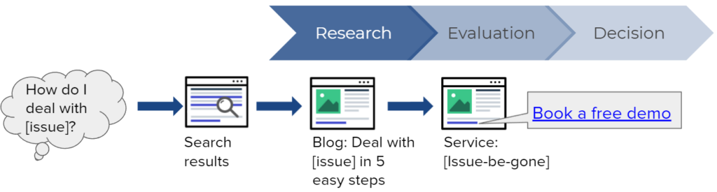
Evaluation ⇢ decision stage
On an evaluation page, they are further along their journey. They know something about you. Now it’s appropriate to ask for something a bit more substantial, so include a call to action to decision phase content.
You want them to submit a lead form, or register for an event, or buy something. In this example: Book a free demo.
If we were to diagram this, it might look like this funnel. Notice the volume of content at each stage. This research stage content does well in organic search. This is why writing and publishing more original content like blog posts is such a great tactic. You’re widening your funnel – creating more opportunities to attract your audience.
So your goal is to move them down the funnel, toward conversion.
Primary and secondary calls to action
Each page should have only one primary call to action.
But, perhaps your potential customer isn’t quite ready to move forward. They need to get to know you a bit better.
If you want to you can add a secondary CTA to move them laterally in the journey –another blog post, an alternate service, etc. The goal is to move customers sideways or forward – never backward.
Two ways organizations mess this up
1. You don’t have any call to action.
Did you know that over 70% of small business websites do not use call to action buttons. 70%!
What happens if you don’t offer a suggestion? Maybe they hit the back button. Maybe they leave your site.
If they aren’t ready to leave they will go back to your navigation menu and have a look. In this case they have to re-evaluate ALL their options and you’ve lost the opportunity to guide their journey.
2. You ask for too much too soon.
Have you ever asked someone to marry you on the first date? Ever ask your new neighbour if you could borrow their car?
Of course not. There is no rapport, no relationship. And yet many websites aggressively shout “Buy now” from every corner.
Don’t act like a used car salesperson on your website. If you save your big questions for when someone is ready to hear them, they will be more likely to say yes.
A clear path for your customers’ journey
That’s it. When you align your messaging and your calls to action with where your customers are in their decision-making, they are more likely to follow your lead.
Creating the journey architecture is step 5 of my 6 step process to improving conversions on your website. And you can do it on your own, without needing a redesign or help from IT. Take a look at my free webinar.
